Essential Elements for Air Purifier App UI
As we explore the domain of air purifier app UI design, we find ourselves confronted with the challenge of seamlessly integrating essential features that cater to users’ needs effectively. From real-time monitoring to intuitive controls, each element plays a significant role in enhancing the user experience. However, there is an important aspect that often goes unnoticed but holds substantial importance in ensuring user engagement and satisfaction. By carefully considering this often-overlooked element, we can truly elevate the functionality and appeal of air purifier apps, setting them apart in a crowded digital landscape.
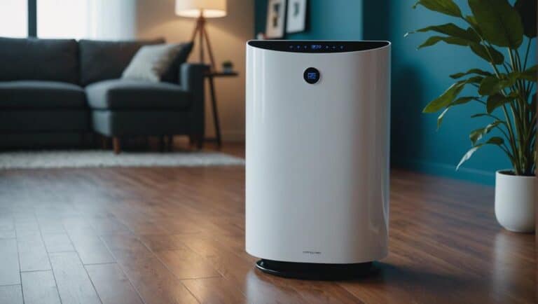
Real-time Data Display
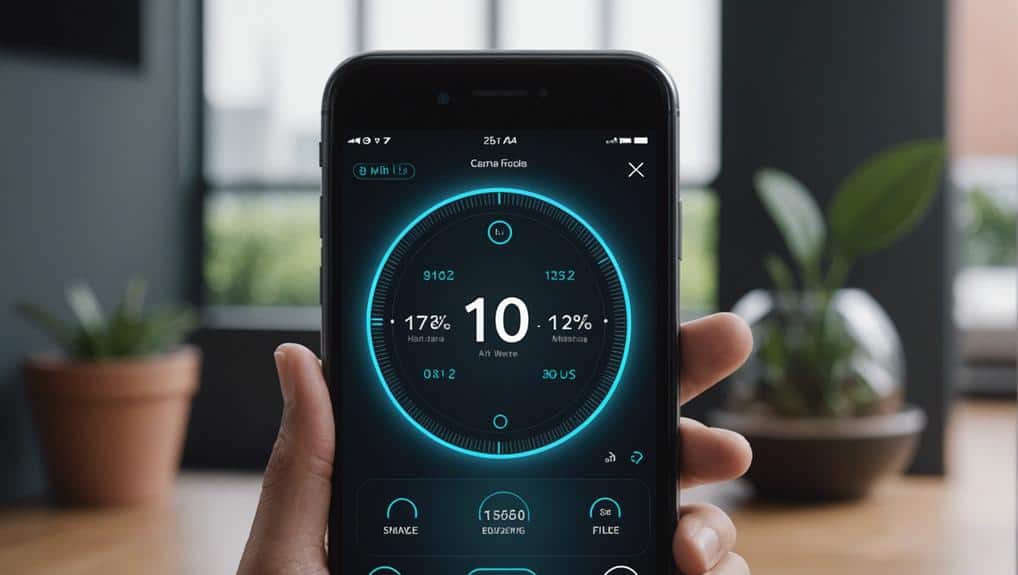
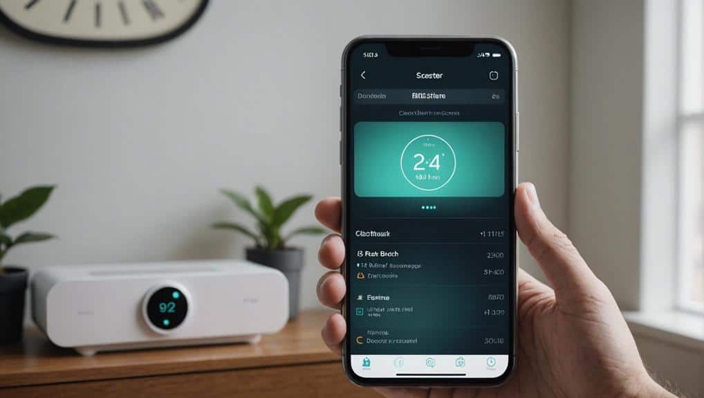
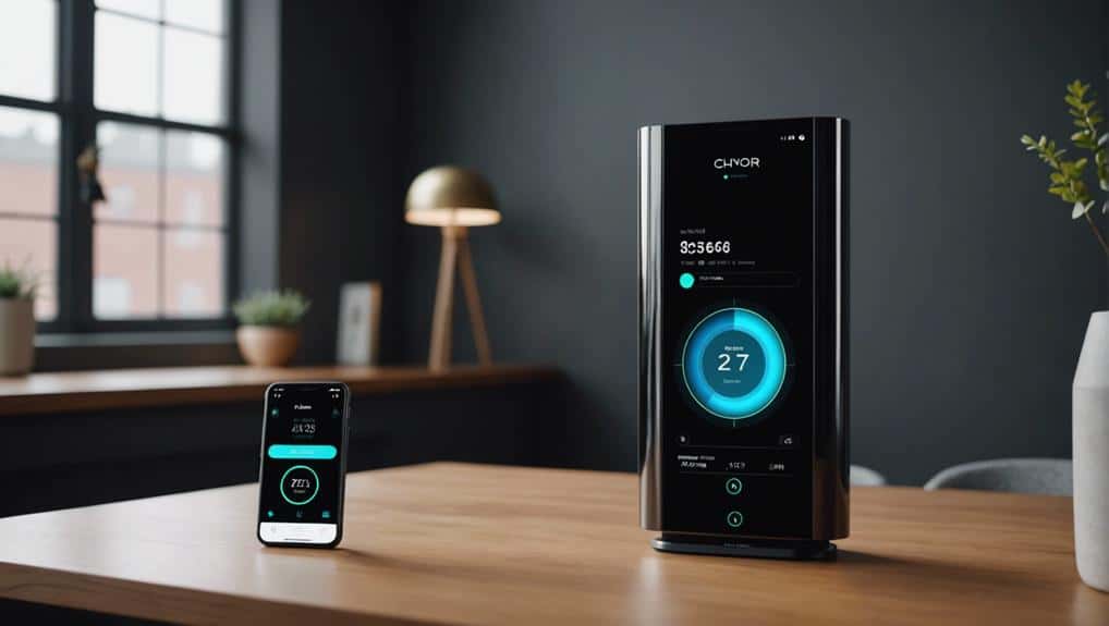
Real-time data display in the air purifier app provides us with vital insights into our indoor air quality. This feature allows us to monitor key metrics such as PM2.5 levels, VOCs, temperature, and humidity in real-time. The graphical representation of this data enables us to track trends and variations in air quality over time effectively. By observing these trends, we can make informed decisions regarding our environment and take necessary actions to improve air quality.
The graphical representation not only enhances the user experience but also empowers us to have better control over our surroundings. Being able to visualize fluctuations in air quality through easy-to-understand graphs enables us to identify patterns and potential triggers for poor air quality. This level of detail and clarity is essential for those who prioritize maintaining a healthy indoor environment. With this feature, we can proactively manage our air quality and create a safer and more comfortable living space for ourselves and our loved ones.
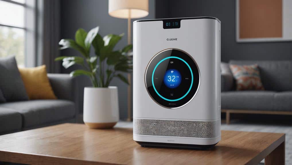
Clear Alerts for Air Quality
Clear alerts for air quality are vital in helping users quickly comprehend the current status of indoor air. When it comes to air purifier apps, having clear and customizable alerts is essential for users who seek to have control over their indoor environment.
Visual indicators, such as color-coded alerts, offer instant information on air quality levels, allowing users to make informed decisions promptly. These alerts can be tailored to individual preferences, focusing on specific pollutants or air quality index thresholds that are of particular concern.
Intuitive Control Settings
When it comes to intuitive control settings on air purifier apps, we prioritize providing user-friendly options that simplify adjusting fan speeds, modes, and timers.
Clear interface design with easily recognizable icons and labels is essential to helping users navigate these controls effortlessly. Additionally, the ability to customize preferences guarantees a personalized experience that optimizes the air purifier’s performance for each user.
User-Friendly Control Options
Integrating intuitive control settings into the air purifier app enhances user experience and simplifies operation. When considering user-friendly control options, it’s essential to cater to the audience’s desire for control.
Here are three key elements to focus on:
- Smart Scheduling: Providing users with the ability to schedule air purifier operation times in advance can help optimize air quality in their space and save energy.
- Remote Control: Enabling users to control the air purifier from anywhere through the app enhances convenience and flexibility in managing air quality.
- Energy Efficiency: Offering settings that emphasize energy-saving modes or providing tips to optimize energy usage can appeal to users looking for eco-friendly options.
Clear Interface Design
To enhance user experience and streamline operation, we prioritize designing an intuitive interface for adjusting fan speed, mode, and timer settings on the air purifier app. Interactive graphics, streamlined navigation, and minimalist aesthetics are key elements in ensuring users have precise control over their air purifier settings. Visual indicators for air quality levels offer immediate feedback, while simple menu structures aid in quick access to essential data. Our focus on clear interface design allows users to effortlessly manage their air purifier, understand indoor air conditions, and receive alerts promptly. Below is a table highlighting the importance of these elements in creating a user-friendly and efficient experience:
| Interactive Graphics | Streamlined Navigation | Minimalist Aesthetics |
|---|---|---|
| Engaging visuals that respond to user input | Intuitive menu layouts for easy access | Clean and uncluttered design for focus |
Customization for Preferences
Moving from the focus on clear interface design, our attention now shifts towards discussing the customization options available for preferences in air purifier apps. When it comes to intuitive control settings, users desire a high level of personalization. Here are three key elements that cater to this need:
- Personalized scheduling: Users can set specific times for the air purifier to operate based on their daily routines or when they expect higher pollution levels.
- Advanced filtering options: Customizable filters allow users to target specific pollutants or adjust the filtration strength according to the air quality requirements.
- Smart sensor integration: Integrating sensors enables the air purifier to automatically adjust settings based on real-time air quality data, offering a hands-free and efficient purification process.
User-Friendly Interface Design
In designing a user-friendly interface for an air purifier app, we prioritize intuitive navigation and easy access to key features. Interactive feedback, user engagement, and simplified navigation are vital aspects of creating a seamless user experience. Clear and concise labeling of functions and buttons enhances usability for all users, ensuring that individuals can easily understand and interact with the app. Essential design elements and color schemes play a critical role in establishing a cohesive and visually appealing app experience. Interactive elements like sliders and toggles provide engaging ways to control settings and monitor air quality, further enhancing user engagement. Additionally, incorporating accessibility features such as text size options and color contrast settings caters to diverse user needs, ensuring that the app is inclusive and easy to use for everyone.
| User-Friendly Interface Design | Benefits |
|---|---|
| Intuitive Navigation | Easy access to key features |
| Interactive Feedback | Engaging user experience |
| Clear Labeling | Enhanced usability |
| Accessibility Features | Inclusivity and ease of use |
Visually Appealing Layout
Let’s talk about the essential aspects that contribute to a visually appealing layout for an air purifier app.
Colorful design elements play an important role in enhancing the overall look and feel of the interface.
A user-friendly layout with a clear information hierarchy guarantees that users can easily navigate and access key features.
Colorful Design Elements
Colorful design elements in an air purifier app’s UI play a significant role in enhancing user engagement and improving visual aesthetics. When incorporating colorful gradients, engaging animations, and interactive color palettes into the design, the app becomes more visually appealing and user-friendly.
Gradients and shadows add depth, making elements pop and improving overall user experience. Engaging animations not only entertain users but also provide visual cues and feedback, enhancing interactivity.
Interactive color palettes allow users to personalize their experience, making the app feel more tailored to individual preferences. By carefully selecting and implementing these colorful design elements, the app can create a vibrant and dynamic interface that captures users’ attention and keeps them engaged.
User-Friendly Interface
Creating a visually appealing layout for the user-friendly interface of an air purifier app involves incorporating intuitive navigation and a clean, modern design with a soothing color palette. To guarantee engagement, we simplify interactions by using clearly labeled icons and buttons for easy use.
Improving accessibility is crucial, so visual indicators for air quality levels provide quick information. Responsive design guarantees seamless usability across various devices.
Customizable settings cater to personalized preferences like fan speed or scheduling options, offering users control over their experience. By focusing on these elements, we create a user-friendly interface that not only looks pleasing but also functions intuitively, making the air purifier app a valuable tool for users seeking a healthier environment.
Clear Information Hierarchy
Establishing a clear information hierarchy within the layout of the air purifier app is important for enhancing user experience and facilitating easy navigation.
When considering the visual hierarchy, it’s essential to prioritize essential information for quick access to key features related to air quality monitoring. Utilizing visual cues such as color, typography, and spacing guides users to important sections, enhancing user interaction.
Consistent design elements play a significant role in creating a cohesive and intuitive user interface, contributing to a seamless user experience.
Responsive UI Features
Implementing responsive UI features in an app guarantees a seamless user experience across various devices and screen sizes. Fluid layouts and adaptive design ensure that the app’s interface adjusts effortlessly to different resolutions, maintaining usability and aesthetic appeal.
By utilizing fluid grids and flexible images, the design integrity remains intact regardless of the device being used. Incorporating media queries enables dynamic adjustments to styling based on specific device characteristics, enhancing the overall responsiveness of the app.
Additionally, touch interactions play a crucial role in creating a user-friendly experience, particularly on touch-enabled devices. These touch-friendly interfaces facilitate intuitive navigation and interaction, making the app more engaging and easier to use.
Enhancing User Experience
Let’s actively enhance the user experience by incorporating intuitive design elements and real-time air quality data visualization in the air purifier app. To improve user engagement and satisfaction, we should focus on the following:
- Interactive feedback: Implement features that provide users with real-time feedback on air quality changes and the impact of purifier settings adjustments. This interactive element will empower users to make informed decisions promptly.
- User engagement: Cultivate user engagement through personalized notifications and alerts based on individual air quality preferences. By tailoring the app’s responses to user behaviors and needs, we can create a more immersive experience that encourages continued usage.
- Design innovation: Aim for design innovation by incorporating intuitive controls and aesthetically pleasing visuals. A sleek and modern interface not only enhances the app’s visual appeal but also contributes to a more user-friendly experience, making navigation effortless for users seeking control over their indoor air quality.
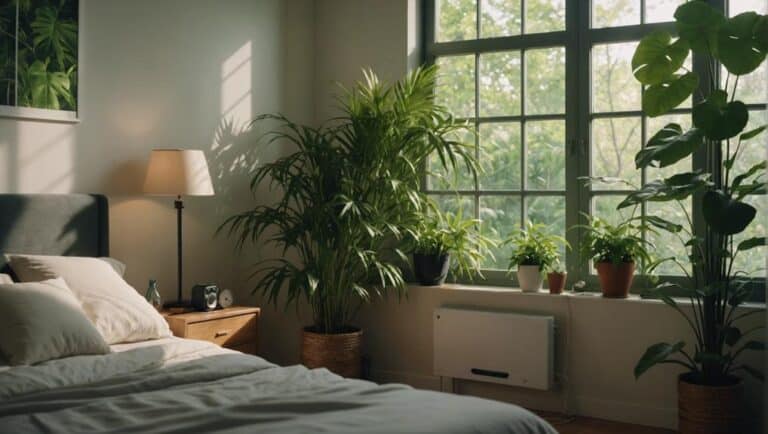
Promoting Healthy Living
To promote healthy living, our air purifier app prioritizes user-friendly interfaces that highlight air quality monitoring and health benefits. By focusing on healthy habits, we empower users to take control of their indoor environment.
The app provides real-time data on air quality, offering instant updates and actionable insights for improved well-being. Personalized alerts notify users of poor air quality conditions, prompting them to make necessary adjustments. Through wellness tracking features, individuals can monitor progress in enhancing indoor air quality and respiratory health over time.
Educational resources within the app offer tips, articles, and guides for maintaining a healthy living environment through air purification. With a clear emphasis on air quality and well-being benefits, our app empowers users to make informed decisions that positively impact their health and lifestyle.
Conclusion
To sum up, integrating real-time data display, clear alerts, intuitive controls, user-friendly interface design, visually appealing layouts, and responsive features are crucial for a successful air purifier app UI.
By prioritizing enhancing the user experience and advocating for healthy living, users can make informed choices and take immediate action to enhance their indoor air quality.
With these components in place, the app can truly empower users to cultivate a healthier living environment.